

By Gladys Narvaez September 30, 2026
Most booking pages are built by people who can see the screen clearly, use a mouse comfortably, and read a date picker at a glance. That covers a lot of customers, but not all of them. Someone with low vision zooming to 200 percent finds the calendar overlapping the form. Someone using a screen reader hears a list of unlabelled buttons and cannot tell which one confirms the appointment.
Someone with limited hand control tries to tab through the fields and finds the focus disappearing into a dropdown it cannot escape. In each case the person wanted to book and could not, and the business never learns why. Building an accessible booking page that WCAG standards actually support is partly a legal question and largely a practical one, because a page that works for assistive technology usually works better for everyone.
Why Does Booking Page Accessibility Matter?
Because a booking page is a transaction, and an inaccessible transaction is a lost customer plus a potential legal claim. Roughly one in four adults in the United States lives with some form of disability according to CDC data, and a meaningful share of them rely on assistive technology or adjusted settings to use the web. Beyond the size of that audience, there is a legal dimension. Title III of the Americans with Disabilities Act covers places of public accommodation, and courts have repeatedly applied it to the websites of businesses serving the public, with digital accessibility lawsuits running into the thousands each year.
Similar obligations exist elsewhere, including the European Accessibility Act and various national standards. The practical point for a small business is that a booking page is often the most functional page on the site, and the one where failure is most costly. If someone cannot read your blog they leave mildly annoyed. If they cannot book an appointment, they go to a competitor.
Accessibility also affects the experience of people who do not identify as disabled. A customer may be using a phone with a cracked screen, browsing in strong sunlight, recovering from an injury, or trying to make a booking while holding something in their other hand. Clear labels, visible focus states, good contrast, and simple forms help in all of those situations.
For a business, accessibility can therefore be viewed as part of the basic usability of the booking journey. The easier it is to understand the available services, select a time, correct an error, and complete the booking, the fewer customers are likely to abandon the process.
What Are WCAG Standards and Which Level Should You Aim For?
The Web Content Accessibility Guidelines, usually shortened to WCAG, are the internationally recognised standard for web accessibility, published by the World Wide Web Consortium. They are organised around four principles, which state that content must be perceivable, operable, understandable, and robust. Each principle contains criteria set at three conformance levels: A as the minimum, AA as the widely adopted standard, and AAA as the most demanding.
Most legal frameworks, procurement requirements, and settlement agreements reference WCAG 2.1 Level AA, which makes that the sensible target for almost every business. WCAG 2.2 added further criteria, including requirements around focus visibility and reducing the need for dragging movements, and it is worth designing toward. You do not need to memorise the specification. What helps is knowing that Level AA covers contrast, keyboard access, labels, error handling, and predictable behaviour, which happen to be exactly the areas where booking forms typically fail.
When reviewing a booking page, think about WCAG in practical terms:
- Perceivable: Can users see, hear, or otherwise understand the information?
- Operable: Can they navigate the page using a keyboard or other input method?
- Understandable: Are instructions, labels, errors, and next steps clear?
- Robust: Does the page work reliably with browsers and assistive technologies?
These principles provide a useful framework even if you are not an accessibility specialist.
How Do You Test a Booking Page With a Keyboard?
Put the mouse down and try to complete a booking using only the keyboard. This single test finds more problems than any automated scanner. Press Tab to move forward through the page, Shift and Tab to move back, Enter or Space to activate controls, and arrow keys inside menus and calendars.
Work through selecting a service, choosing a date and time, filling in your details, and confirming the booking. As you go, watch for the specific failures that come up again and again on booking pages.
Focus should always be visible, meaning you can see clearly which element is selected, and the order should follow the visual layout rather than jumping unpredictably. Every interactive element should be reachable, including custom dropdowns, calendar cells, and modal close buttons.
Nothing should trap focus, which happens most often in date pickers and pop-up dialogs where Tab cycles endlessly with no escape. If you cannot complete a booking with the keyboard alone, neither can a significant group of your customers.
A useful keyboard test is to ask:
- Can I reach every field and button?
- Can I tell where the focus is at every stage?
- Can I open and close menus without a mouse?
- Can I move through the calendar?
- Can I select a time slot with the keyboard?
- Can I close a popup using Escape where appropriate?
- Can I reach and submit the final booking button?
If any answer is no, the booking flow needs attention.
What Do Screen Reader Users Need From a Booking Form?
Information that the visual design conveys silently. Sighted users understand a form through position, colour, and proximity, none of which a screen reader announces. The gap has to be closed with proper markup and clear text.
Every input needs a programmatically associated label, not just a placeholder, because placeholder text disappears when typing begins and is inconsistently announced. Required fields should be marked in a way assistive technology recognises rather than only with a red asterisk.
Error messages need to be linked to the field they describe and announced when they appear, rather than sitting silently at the top of the page. Headings should follow a logical order so users can navigate by structure. Buttons need meaningful names, so a control that says Book Appointment is far better than one that says Submit or, worse, contains only an icon with no text alternative.
Dynamic changes, such as available times loading after a date is chosen, should be announced through a live region so the user knows something happened.
It is also important to remember that a screen reader does not simply “read the page.” Users often navigate by headings, landmarks, form controls, links, and buttons. A booking page with a sensible structure makes that navigation much easier.
How Much Colour Contrast Does an Accessible Page Need?
WCAG Level AA sets specific ratios, and they are easy to check. Normal-size text needs a contrast ratio of at least 4.5 to 1 against its background. Large text, meaning around 18 point or 14 point bold and above, needs at least 3 to 1. Interface components and meaningful graphics, including input borders, icons, and focus indicators, also need at least 3 to 1.
The table below shows where booking pages commonly fall short.
| Element | Common Problem | Requirement |
| Body text | Light grey on white | At least 4.5 to 1 |
| Placeholder text | Very pale grey inside fields | At least 4.5 to 1 if it conveys information |
| Disabled or unavailable times | Faded to near-invisible | Should remain distinguishable |
| Input borders | Thin light grey lines | At least 3 to 1 |
| Focus outline | Removed by custom styling | Visible and at least 3 to 1 |
| Error text | Red on white at small size | At least 4.5 to 1 |
| Buttons | Brand colour with white text | Check the actual pairing |
Free contrast checkers make this a five-minute job. The most common failure is greyed-out unavailable time slots, which often fall so far below the threshold that some users cannot tell whether a slot exists at all.
Remember that contrast is not only about body text. The things users need to interact with also need to stand out. A faint border around a form field or an almost invisible keyboard focus indicator can make a booking page difficult to use even when the main text passes a contrast test.
Why Should You Never Rely on Colour Alone?
Because a meaningful percentage of users cannot distinguish the colours you are relying on. Colour vision deficiency affects roughly one in twelve men and a smaller share of women, and screen brightness, glare, and monochrome displays affect others.
Booking pages lean on colour constantly, using green for available slots, grey for booked, red for errors, and highlighted colour for the selected date. Every one of those signals needs a second cue.
Available and unavailable times should differ in more than shade, using text, strikethrough, or an icon. Errors should carry a written message alongside the red border, not just the colour change. The selected date should be marked with a border, a checkmark, or bold weight as well as a fill colour.
A quick way to test this is to view your booking page in greyscale, either through browser developer tools or a design tool, and check whether you can still tell what is available, what is selected, and what went wrong.
Which Parts of a Booking Widget Cause the Most Problems?
Calendars and time pickers, by a wide margin. Custom date pickers are frequently built as grids of clickable divs with no semantic meaning, no keyboard support, and no announcement of which dates are selectable.
If you build your own, the calendar should be navigable with arrow keys, announce the date and its availability, allow escape from the widget, and offer a text input alternative for people who would rather type a date than navigate a grid.
Modal dialogs are the second problem area, since they often fail to move focus into the dialog when it opens, fail to return focus when it closes, and cannot be dismissed with the Escape key.
Multi-step booking flows create a third issue when progress is not announced and users lose track of where they are. Timers add a fourth, since holding a slot for a limited period can disadvantage anyone who needs more time, and WCAG requires that users can extend or turn off most time limits.
Other common problem areas include:
- Custom dropdowns: They may look like standard controls but behave differently for keyboard and screen reader users.
- Time-slot grids: Users may not know which times are available, selected, or unavailable.
- Pop-up calendars: Focus can become trapped or disappear when the calendar opens.
- Loading states: New availability can appear without being announced.
- Multi-step forms: Users may not know which stage they have reached or what remains.
- Session timeouts: A customer may lose their selected appointment because the page expires before they finish.
Testing these elements individually is often much easier than trying to diagnose the entire booking flow at once.
What About Forms, Errors, and Confirmation Messages?
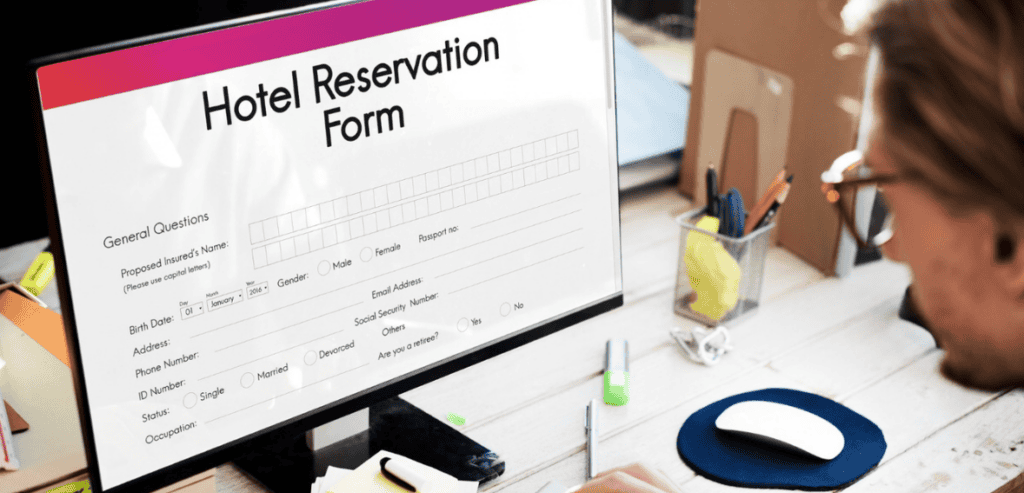
Form handling is where accessible design and plain good design overlap almost entirely. Labels should sit above or beside fields and remain visible while typing. Group related fields, such as a name split into two inputs, using a fieldset with a legend so the relationship is announced.
Autocomplete attributes on common fields like name, email, and phone help both assistive technology and anyone using browser autofill.
Error handling deserves particular care. Identify errors in text, describe how to fix them rather than simply stating that a field is invalid, place the message next to the field, and move focus to the first error so keyboard and screen reader users are not left hunting.
Success matters too. When a booking is confirmed, announce it clearly, keep the confirmation on screen rather than flashing it briefly, and include all the details the person needs. A confirmation that only appears as a green flash for three seconds is invisible to a large group of users.
The same principle applies to instructions. Instead of saying “Invalid input,” explain what is wrong: “Enter a valid email address, such as [email protected].” Clear instructions reduce frustration for everyone, not only people using assistive technology.
Does Mobile Accessibility Matter for Booking Pages?
Yes. A booking page can meet basic desktop accessibility requirements and still be frustrating on a phone. Many customers book appointments from mobile devices, so controls need to remain usable when the screen is small and the page is zoomed.
Make sure buttons and form controls have enough space to activate without accidentally selecting a neighbouring option. Avoid requiring precise dragging or tiny calendar targets. Content should reflow when the viewport becomes narrow, rather than forcing users to scroll horizontally.
The same applies when users increase text size or zoom the page. Important information should not disappear behind fixed headers, overlap other controls, or become impossible to operate.
Mobile accessibility is especially important for booking because the user is usually trying to complete a task rather than simply read information. If the final confirmation button is pushed off-screen or a date picker becomes difficult to navigate, the customer may abandon the process at the final step.
How Can You Check Accessibility Without a Specialist?
Combine automated tools with manual testing, because each catches what the other misses. Automated scanners such as the free browser extensions built on open-source accessibility engines will find missing labels, contrast failures, and structural problems within seconds, and they are a sensible first pass.
However, automated testing typically identifies only a portion of real accessibility issues, so it cannot be the whole programme.
Add three manual checks that anyone can perform. Complete a booking using only the keyboard. Zoom the browser to 200 percent and confirm the page still works without horizontal scrolling or overlapping content. Turn on the screen reader already built into your operating system, such as VoiceOver on Mac or Narrator on Windows, and attempt a booking with the screen switched off or your eyes closed.
That third test is uncomfortable the first time and unusually revealing. Where budget allows, testing with actual users who rely on assistive technology is worth more than any checklist.
A simple accessibility review can therefore be built into normal website maintenance:
- Run an automated scan after major changes.
- Complete the booking with a keyboard and no mouse.
- Test at 200 percent zoom and on a small screen.
- Check the main booking flow with a screen reader.
- Test errors and confirmation messages, not just successful bookings.
- Record recurring issues so developers can fix the underlying problem instead of patching individual screens.
What If Your Booking System Is Third-Party Software?
Most gyms, clinics, salons, and studios do not build their booking page, they embed one, which limits how much they can change directly. That does not remove the responsibility, since the business remains the one serving the public.
Start by asking your provider for their accessibility documentation, often published as a VPAT or an accessibility conformance report, which states which WCAG criteria the product meets. Test the embedded widget yourself using the keyboard and zoom checks above, because vendor claims and real behaviour sometimes differ.
Where you find problems, report them specifically, since a clear description of a failing element is far more likely to produce a fix than a general complaint.
Meanwhile, provide an accessible alternative route, such as a clearly signposted phone number and email address for booking, and make sure staff can complete a booking on someone’s behalf. That alternative is a sensible backstop rather than a substitute, because directing disabled customers to a separate channel is not equivalent access when everyone else can self-serve.
It is also worth asking providers about their accessibility roadmap, not just their current compliance statement. A platform may have known limitations that are scheduled for improvement, and understanding those limitations helps you decide whether to work around them, request a fix, or consider another solution.
Making Accessibility Part of How the Page Is Built
Accessibility works best as a habit rather than a retrofit, and the habit is small. Test with a keyboard whenever the booking flow changes. Check contrast when you change brand colours. Keep labels visible and error messages specific. Never signal availability with colour alone.
Ask your booking software provider about their conformance and test their widget yourself rather than assuming. Then run a fuller review once or twice a year, ideally including someone who uses assistive technology daily.
It also helps to treat accessibility as part of the normal development checklist rather than a separate project. Whenever you add a new service, calendar, payment step, popup, or form field, include accessibility in the same review as mobile responsiveness and performance.
The return on this work is not only legal protection. A booking page that works with a keyboard, reads clearly at high zoom, and explains its errors properly converts better for everyone, including the perfectly sighted customer trying to book on a phone in bright sunlight with one hand full.
Final Thoughts
An accessible booking page should let customers navigate, understand, correct mistakes, and complete a booking without depending on a mouse, perfect vision, or colour cues. Start with keyboard navigation, screen reader labels, contrast, clear errors, and properly built calendars. Test the actual booking journey rather than relying only on automated tools, and remember that third-party software still needs checking. Accessibility is not an extra layer added after the booking page is finished; it is part of making the booking process work.